
Role: The design team ensures a seamless user experience by creating intuitive interfaces and deployment tools. Their focus on real-time execution enables global participation in spot auctions and lotteries, driving adoption of blockchain technology and smart contracts.
Web Section Descriptions
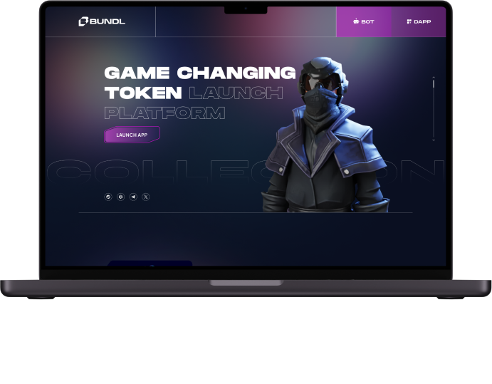
Control Section
he first section, “Own full control of your launch,” is meticulously crafted to captivate users from the moment they land on Bundl’s platform. Visually, it boasts a striking banner that seamlessly integrates with Bundl’s established branding, leveraging imagery that resonates with the user’s desire for control and empowerment. The call-to-action is carefully crafted to be concise yet compelling, inviting users to take charge of their project launches with Bundl.
From a design perspective, every element is meticulously curated to enhance user engagement. The layout is strategically optimized for both aesthetic appeal and functional clarity, ensuring that users can easily navigate the interface and understand its purpose. Moreover, the section’s responsiveness ensures a seamless experience across various devices, while prioritizing accessibility guarantees that all users, regardless of their abilities, can fully engage with Bundl’s offerings.
On the development side, rigorous optimization efforts are undertaken to guarantee lightning-fast loading times, minimizing any potential friction that could deter users from exploring further. This section serves as the gateway to Bundl’s platform, enticing users to delve deeper into what Bundl has to offer and empowering them to take control of their project launches like never before.
Buttons Section
The second section of Bundl’s interface is dedicated to providing users with clear and intuitive pathways to key functionalities. Three distinct buttons—’Launch App,’ ‘Launch Bot,’ and ‘How to Use’—take center stage, strategically positioned for maximum visibility and ease of interaction.
From a design standpoint, each button is meticulously crafted to ensure clarity and accessibility. Bold typography and contrasting colors draw attention to each option, facilitating easy identification and encouraging users to take action. The layout adheres to established design best practices, striking a harmonious balance between aesthetics and functionality.
Behind the scenes, each button is imbued with intuitive functionality, seamlessly guiding users to their desired destinations with minimal effort. Whether users wish to dive straight into launching their app or bot or seek guidance on how to make the most of Bundl’s platform, the buttons serve as reliable navigational aids, facilitating a smooth user journey from start to finish.
Sign In Section
The Sign In section is purposefully designed to streamline the login experience for developers, prioritizing security and efficiency. Through a clean and minimalist interface, users are guided through the authentication process with ease, ensuring swift access to Bundl’s platform features and resources.
Native Token Benefits Section
In the fourth and final section, titled “Native Token,” the emphasis is on introducing users to Bundl’s native token and its associated benefits. The section includes informative text explaining how users can earn revenue share by staking the native token. Additionally, it provides essential details regarding tax implications, revenue sharing mechanisms, and token price dynamics. This section aims to educate users about the token’s utility and incentivize participation in Bundl’s ecosystem through staking and revenue-sharing opportunities.